Blog Post #1-Close Reading of Gustave Dore’s Illustration
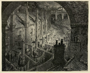
Though I closely examined all of Dore’s work in his collection of illustrations titled London: A Pilgrimage, for my close reading I settled on image #9 in the collection. This image portrays the housing developments of the time in London. There are a few aspects of these developments that really stood out to me. First of all, the are all connected in a row, with absolutely no space in between each of them from side to side. The main row of the houses featured as the subject in the illustration seems to go on almost into the foreseeable future as it may be. Viewers of the image can tell that the houses represent lower class living because not only are the houses all crammed next to each other, but they are very small in terms of the width of each home. They all span only the width of one window, with what would appear to be a few feet of space on each side of the window. Even without ever having been in these houses, viewers can almost feel how tiny they would be just by looking. Each house does have a back patio, where some people are featured to be utilizing in the image. This space contradicts the modern use of a back patio, how most would see it as extra space to use to enjoy the outside while at home. But, these spaces are strictly seen as functional—with many of them having laundry lines and barrels for storage. This again emphasizes the idea of the poorer working class inhabiting these houses.
Another characteristic of this image is the ominous tone it gives off to viewers. It almost seems as though there is no sunshine at all in the sky, everything looks so dreary and dark. Considering that whatever medium Dore used to create this piece was just black or gray, it is evident that no actual color was ever going to exist, but viewers can get a good idea of how the tone is intentional through his shading. Dore makes the sky look darker than the subject of the housing, and it almost seems as though he’s casting some sort of shadow on the row as it moves further back in the image. Since this illustration is depicting housing of that of the lower class, the tone of the image seems to mimic how people view this class of Londoners. Overall, the piece gives a very specific idea of London living, one that most viewers most likely do not want to experience.
47 thoughts on “Close Reading of Gustave Dore’s Illustration #9”
You must be logged in to post a comment.