B3: “Close Reading” of Poverty in Gustave Dore’s Art
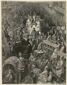
For a bit of practice doing “close readings” on images, I decided to analyze a photo from Gustave Dore’s London: A Pilgrimage collection for this blog post. The image I selected is titled ‘A City Thoroughfare.’ For reference, I attached a link to the image. The first thing I noticed when looking at the image is that a lot is happening; it is a chaotic scene. People are in carriages side-by-side, the street is filled with other people on foot, and the two rows of buildings on either side frame all that is happening. Everyone is trapped on this one street. The style is very shadowed; the lines between individuals are not distinct. Shading is heavily used. It appears to be blended and blurred on purpose. No individual looks like the center of the piece. Rather, it appears that the chaos is spotlighted over the individual. Only lower-class citizens are presented. Identifiable people in the image are all working class. Identifiable individuals include policemen, men moving large boxes, carriage drivers, and children crammed into the top of a carriage. The rest of the people seem to just be a mass, stretching the whole way to the end of the view.
The image is very dark in physical composition and tone. The sketch has no ray of light or any type of hope presented. It is only dark. For the most part, the individual is unidentifiable; it is just the mass of people presented. This represents the lower-class as a group rather than as individual people, showing the dehumanization of this social class. On the right side of the image, the faces that can be seen are crammed into small areas, and although their expressions are not entirely present, the ones that are presented appear to be in disgust or pain. The hustling street does not look like somewhere glorified, rather it appears stifling and painful. No one looks like they want to be there, and nothing about it is comfortable. This is the dark side of London that tourists and the upper-classes avoid.
The depiction serves as a raw look at lower-class lives, and it shows these people as an indistinguishable group on a busy street. The chaos shows how the lower-class was forced to live uncomfortably, in pain, and was valued less than the upper-class citizens who would never dare to be trapped in such a congested street. The image evokes feelings of disorientation as there are not very many people who stand out in the image, nor are there very many ways to determine the location of this street in relation to the rest of London. It looks at London in a very realistic and unglorified manner. If anything, it shows the extreme side of poverty in London. The dark nature demonstrations how the social hierarchy erased the individual in mid-Victorian London, and it places the viewer in an uncomfortable position of viewing the lower-class’ suffering.
Dore, Gustave. London: A Pilgrimage: ‘A City Thoroughfare’. British Library, London. Web. <https://www.bl.uk/collection-items/london-illustrations-by-gustave-dor>.
This is such a fantastic image! And yes, it highlights the stark differences between working-class and middle/upper-class London. There are a variety of really intriguing representations of this difference in Victorian media. For instance, in 1889 Charles Booth created a series of maps of London (“Maps Descriptive of London Poverty”) color-coded by the relative poverty of the streets. Looking at these maps you find another striking visual representation of poverty and overcrowdedness in the city: https://booth.lse.ac.uk/learn-more/what-were-the-poverty-maps
Katie,
I completely agree with all of your thoughts regarding this illustration! I spent some time looking through a lot of Gustave’s collection and it seems to me that a lot of his pieces portray the “darker, dirtier, lower class” side of London. This image in particular does show “chaos” in it’s most basic form, I think. I also found your remark about how no one individual, or even the individuals themselves are the subject, and how you think it’s more the chaos itself that is the subject very distinctive! This idea is not something you would really consider to be so different, but if you think about it, most images have a person or object as their focal point, but not this one. I also agree with your thoughts on the mood of the painting and how it’s almost ominous. It almost looks like there is no sun at all in whatever sky that would be presumably above them. The image that I am going to close read has a similar feel to it. It seems like a very intentional choice on Dore’s part. Anyhow, I loved reading your thoughts, thanks for sharing!
Rachel