After looking at all of the images from each of the collections, Dore’s and Thomson’s, I was really struck by how different they seem to be. While each are portraying London from the working classes, they seem to have very different images of what the horrors of this class entail. In Dore’s illustrations, the viewer gets a sense for how horrible conditions were for the poor in London at this time. His images of these people in many different setting including markets, work, and homes are all illustrated to be very dark. In comparison, the few images which represent the upper classes of society are colored in a much brighter and whiter way. This color contrast alone is relating to the viewer the stark contrast of the classes, and the injustice of these deplorable differences in condition.
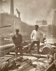
In Thomson’s photographers, it is with a much more forgiving and upbeat tone that the viewer takes in the scenes. This is especially made evident in the text accompanying the images. For example, the viewer is often given a short history of the person in the image, telling a story of someone who has overcome odds, pulled themselves up by their bootstraps, and outweighed the evils of their condition with hard work and sacrifice. A specific example from the image titled Workers on the “Silent Highway” perfectly demonstrates this attitude: “Fortunately, the very nature of their occupation compels the men to enjoy plenty of fresh air and invigorating exercise, and this naturally counteracts the evil effects resulting from their occasional confinement in cabins unfit for human habitation.”
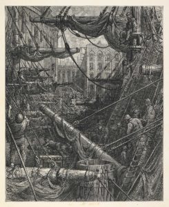
In order to better express the truth in this argument, consider the following two images, each depicting a similar scene:


In the first, the scene is clearly overcrowded. There are multiple ships, all one on top of the other. There are also many men at work, all of whom seem to be seriously employed in completing a task. These jobs appear to be very dangerous: there are men supported only by the bows of the ship, some are covered in what must be heavy ropes, and others are climbing unsupported up the masts. Add in the the fact that there are no empty space in the image, and the subsequent darkness of it, and the viewer gets a sense for how undesirable a job of this nature would be.
On the other hand, the second image appears significantly less scary. In it, there are only two men on a much smaller vessel, which is also not overcrowded by a multitude of other ships. While the men still appear to be employed in a task of some sort, their jobs look less vigorous and dangerous than those depicted in the illustration.
While the photo is by its nature more realistic than the illustration, it still seems to be holding back from revealing the true nature of their position. This is evident in the quote stated above which describes why their jobs are “fortunate.” The illustration therefore almost seems more truthful. However, it too seems to hold some level of exaggeration in order to favor a certain point of view of the subject. After all, it seems impossible that so many ships could ever truly function if they were that close to one another. Therefore, it takes a close reading of both images, analyzed and interpreted with open-mindedness and a concern for the true condition of the poor, working class of society to get a realistic depiction of the truth.
A great choice of images to compare! Your post brings up some interesting questions about what we mean by “Realism” or “realistic.” We might assume that a photograph is more “realistic” than an illustration, and yet your post seems to imply that, in fact, there are ways in which we might read the illustration as more truthful than the photograph!