
Two art works that stood out to me in the Gustave Dore’s illustrations. The first one is “A Ball at the Mansion House”.Gustave Dore put a lot of effort with the little details in this print. The women’s dresses and the small details of layers and decorations make them look elegant and expensive. It really show you what social class they are in. The chandeliers have a lot of detail and even the walls with the columns. This image makes me feel smug for some reason. Just the way they present themselves with their posture and their facial expressions.
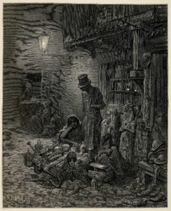
Another print that stood out to me was the print of a mother and her kids in poverty. They look like they are trying to sell items to get money. This print is darker then the “A Ball at the Mansion House”. The lines are really close together making the image darker and dull. He made this print darker to show the poverty in London and not all things are great. There are families who have to make their own work, so they can get by. The people in this image are slouching/slumping, they look tired and upset. The women is resting her elbow and you can tell be her facial expression she is looking lost. There is a man looking down on her. He doesn’t look like he is in poverty by this top hat and coat. It looks like to me he is shaming her. Looking at this image it makes you feel sad for them. There is nothing happy about this image at all. There are two kids wrapped up in a blanket looking cold, just wanting a place to stay.
Comparing the two you can see the difference between the two. You can tell that it is about two different social classes by the way they look. But with the body language they have really speaks volumes. In art it is hard to express feelings through paintings especially black and white. He did a good job of using the body language to show you what they are feeling.
These images are the difference between two social classes. The lower class needs to create work so they can live day to day. They have no days off. Whereas middle/upper class can go to balls and not worry about money. He showed that by the lightness of “A Ball at the Mansion House” and the darkness in the other image.
What a great comparison! Compositionally, the pictures are strikingly similar. There’s a balance between the environmental details (the buildings, the lights) and the figures. But what stark differences! And yes, the difference in light is particularly striking. I’m struck by those long white necks in “A Ball at Mansion House”!